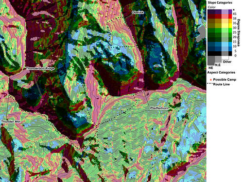
sisyphus wrote:For you backcountry snow travelers, here's a sample hazard map from a series that I'm thinking of making. Let me know what you think! Of course I know the map has scale limitations, but it seems like it could be a useful tool nonetheless . . .
Wow, neat stuff. What software are you using to create that? For touring, I use a Topo! map that I created that has ascent skintrack routes, skiing routes, sites of old avalanches, etc. on it, so I think all that plus your color code would make my map unreadable. However, I still think these maps are great for research and for a better visual interpretation of the slope angles. I'd love to see more.
It takes a while to make the maps, but once you have everything together, it's not too bad. I used a few sources to make this in a few steps:
1. Get free DEM files of the desired area from
GIS Data Depot.
Files are organized by the geographic place name of the map, but it is easier to use the Lat/Long code and the ctrl-F browser search feature. It's a bit of a pain, but I've collected and merged DEMs for the entire Wasatch Range now.
2. Make map layers using any GIS software. I've been using
MicroDEM which works well. In here I make 4 layers that are each saved as a jpeg for combining in the next step.
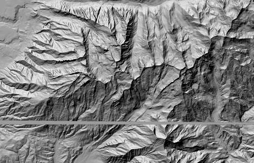
A reflectance map to help bring out the 3-D shaded appearance of the final map.
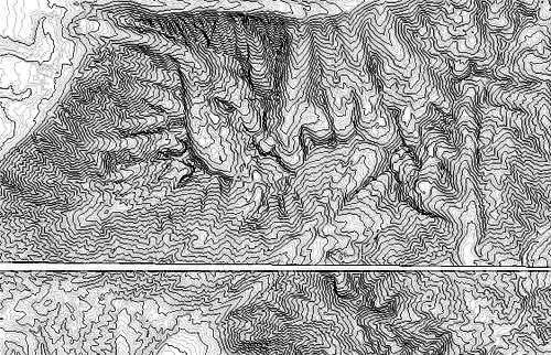
A topo contours map.
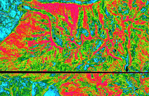
A color-coded slope map, where I manually assign the slope increments (in %) to various colors.
A slope aspect map, which colors the map based on the direction each slope is facing. In this map I only used the N, NE, and E aspects.
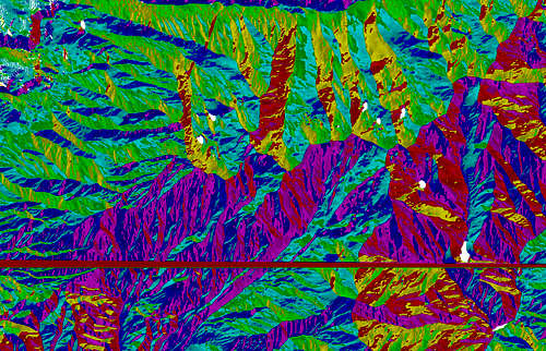
3. Combine the map layers in an image editing program with layers, such as Adobe Photoshop.
In this map, I did it in the following way:
Base Layer: Reflectance Map - set at 50% opacity so that it doesn't make the rest of the image too dark.
2nd Layer: Slope Map - using the "Multiply" layer option to allow the shading of the base layer to show through.
3rd-4th Layers: Aspect Maps - I separated each aspect color into a separate layer by using the color selection option. In the separate layers you can then manipulate them further.
In this case for the 3rd layer I represented N-E aspects (CCW) by selecting the shapes in those layers and filling them in black. The layer is set at 50% opacity. I also filled in the rest of the layer with white, which lightened the slope color map, making it easier on the eyes to read (the original colors are a bit harsh).
For the 4th layer I only selected the NE aspect and filled it in black. For this map, 65% opacity seemed to be a good balance of bringing out the layer but not hiding the detail.
Top Layer: Topo contours - using the "Multiply" layer option to allow the rest of the map to show through between the contour lines.
All done!
Then I just save the final map and bring it through Photoshop again for any map annotations that I want to add (in this case, the map key, route, camps, and feature names). So you could always selectively add a few of your map features to it (e.g. old avalanche sites), just taking care to not clutter it too much to be useful.
Since it takes a while to do this, but is fast once everything is set up, I wanted to make sure the current map style works well for people before I put too much time into making something that isn't yet optimal. If you-all think that the current map is fine, then in the next month or so I'll be making this sort of map for the Wasatch Range from the Wellsville Mtns down to Mt Nebo.
One change I think I will make is to eliminate the green color for 15-20 degree category. It is too hard to distinguish from the other greens, and my main color changes seem to follow general slope hazard categories: High = yellow-red-purple, medium = greens, low = blacks-blues. So I think I'll bump up the blues colors in the scale (so that 15-20 degrees is light blue) and make the 5-10 degree color gray to nicely transition between black and dark blue.