
-
 9563 Hits
-
 93.81% Score
-
 44 Votes
Overview
"The secret to creativity is knowing how to hide your sources." -Albert EinsteinThis article is for all audiences wanting to contribute to SummitPost. Whether your new to SummitPost or frequently post content, there are many things we can do to make our posts as good as possible. I will try to simplify the thinking process of page creation, increase the creativity, and give folks an idea of how to expand our pages to make them great. I've done many hours of research and have conducted many experiments to try and perfect my vision of what a great page would look like.
The first sections of the article will explain about how to piece together pages we typically make here on SP. Later on it will explain about more advanced techniques we can use to personalize our content, making maps, and diagrams for those visual learners. I do this not to destroy the mystique, but encourage people to get outdoors and help others obtain their goals. I hope to bridge the gap between new members and those who are knowledgeable with posting.
Where to Begin?
 Be Inspired to Write
 What made us go There
On a trip report introduction you can say things like what inspired you to climb that mountain, perhaps mention some planning, talk about how awesome the trip was, mention a range of places you went to.
Personally I like to start out with some sort of layout by creating blank sections and then filling in the blanks. This makes it so I don't feel overwhelmed with what to do next, I always have an objective of what I need to fill in.
Typically on my pages I have between 7-15 sections depending on how much can be covered on a particular peak. Here is a list of sections I may use for a page: Overview, Routes, Getting There, Standard Climbing Route, Descending, Red Tape, Camping, When To Climb, Mountain Conditions, Gear for the Climb, Topographic Maps, History, Sunset and Sunrise Photos, Views, Alternative Routes, Wildlife and Flowers, Video Documentary, and External Links.
Start out by making a custom object so that you do not lose your audience when you post the real page. This allows you to do page experiments and not feel pressured about time for when the page has to be completed. When your finished copy the contents over to a new page.
Route Descriptions
 Taking Pictures on the Way
Describe any complications and route difficulties along the way to the summit. Use fewer words but not too few. Read what you wrote and see if it flows. Fix grammar errors and choppy sounding sentences.
Sometimes we Forget
In some cases when posting a page I can forget critical directions to climb a mountain like "take a left at the upper gully". So to make up for this I take tons of photographs on my adventures. If I have any missing photographs, I simply do a search though trip reports to find proper directions. It is very important that you get directions right. If you don't know something, say so.
Mention all the Routes
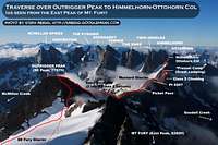 A Thousand Words Diagram
 Labeled Routes on Stuart
Now for some mountains it may be hard to mention all the available routes, in that case just mention the main ones.
Getting There Directions
Now days directions to places are easier than ever! So why not take advantage of things like Google Maps to easily describe the directions to certain trailheads. Just type in the nearest major city for the starting location and type in the trailhead name for the ending location. The search couldn't find the trailhead name? Not a problem. Just type in the name of the nearest town or road to that trailhead. Now click the location B on the map and drag it to the trailhead. Sometimes this is very necessary when it is mapped in the wrong location. Once you have the map just the way you want to show everyone else you can link to this map by pressing the link button as seen in the following picture:
Dragging the Marker for Directions to a Trailhead
 Mount Shuksan on the Way
View Google Maps Directions here. [122 Miles | 2 Hours & 53 Minutes]
Getting there from Seattle: Directions...
If there are multiple trailheads for a mountain I'll format it a bit differently like this:
Schreibers Meadow : The Direct, Easton, and Squak Trailhead (South)
View Google Map Directions here.
From Seattle: Directions...
This makes it so people can easily find the directions from their homes. Plus this will make it easy for you to give directions from a major city. You could either write it out as a paragraph or write it out like Google does by simply saying things like "take a left here". Using pictures along the car ride also helps add to the page. Just to the right of this text is an example of how I place it in.
Red Tape, Camping, When to Climb, Weather and Conditions
It's important to mention red tape, camping, when to climb, and Weather and Conditions.Red Tape: For this section mention things like permits, day passes, parking fees, ranger stations, and how to obtain the pass/permit. Perhaps you could mention some other fun facts like water sources and time it takes.
Camping: Mention as many camping places as you know or remember. Mention it's elevation in parentheses and perhaps some distances. In some cases its good to combine the camping with the red tape if the red tape is about the camping. Here's an example of a table used for showing different camp spots:
| Camp Name | Distance | Elevation | Image |
| Colonial Creek Campground | 0 Miles | 0 KM | 1232 ft. | 375 m |  |
| Thunder Camp | 1.8 Miles | 2.9 KMs | 1261 ft. | 384 m | 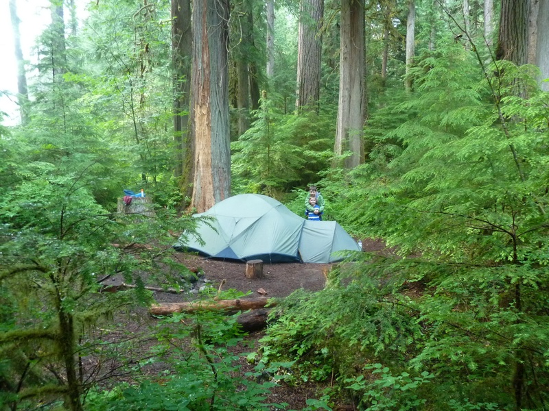 |
| Neve Camp | 2.1 Miles | 3.4 KMs | 1461 ft. | 445 m |  |
| McAllister | 5.7 Miles | 9.2 KMs | 1887 ft. | 575 m |  |
| Tricouni | 7 Miles | 11.3 KMs | 1950 ft. | 594 m | 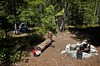 |
| Junction | 9.2 Miles | 14.8 KMs | 3101 ft. | 945 m |  |
| Skagit Queen | 13 Miles | 20.9 KMs | 2407 ft. | 733 m |  |
| Thunder Basin | 15.9 Miles | 25.6 KMs | 4405 ft. | 1342 m |  |
| Fremont Glacier | 19 Miles+ | 30.6 KMs+ | 7961 ft. | 2426 m |  |
When to Climb: Describe the best times of the year to climb that particular peak. If your not sure, check though the climber logs and ask other members about how it was when they were there. Look around for trip reports that describe what its like at a particular time. Use websites that give a history on road closures like WSDOT to give you an idea of when that particular road closes at.
Weather and Mountain Conditions: Describe some things you might know about the weather in that region for example if rapid changing weather is common or thunder storms in the afternoon. Is there avalanche danger though out the year? Give out site links like NWAC for avalanche danger for a particular region. Also give a weather link to websites like the National Weather Service with an exact location of the mountain your describing. A road condition link would also be nice to have.
Gear for the Climb
Although not technically required on a page, a list of gear makes trip planning a lot easier. The more complicated the mountain, the more important this list becomes. Does the route require an ice axe? Or might it come in handy? I separate my gear by mandatory gear and recommended gear. Both sets I personally bring but one could "technically" get away without. When it comes to rock climbing it becomes even more important like "A Number 2 Cam" so that people can reduce the amount that they carry. Using Ice Tools Using Ice Tools |  Roped Up to Climb Roped Up to Climb |  Heavy Pack Heavy Pack |  Snowshoeing Snowshoeing |  Placing in a Cam Placing in a Cam |
Show some Views
Be sure to show some nice medium sized pictures on the page. I've seen a number of times were people created a section specifically for views, sunsets, sunrises, aerial shots, and so on. This helps inspire people even more to summit the peak that you are writing about. If there are a lot of amazing shots, use lots of thumbnails and place it in a table [Example]. Videos are also a nice way to show the route or scenery along the way. Here's an example:Develop your Own Style
It is important to develop your own style or adopt a style that you like. This helps with page formatting and in a sense is like a template. This can effect the structure of the entire page in a positive way. Here are some examples of personal styles: | Thunder Slam | Trip Report tells the story though pictures and captions. Also includes diagrams and colored font. |
 | Picket Range | Uses tables to display pictures and also has a neat table on contents. |
 | San Juan Range | Uses many thumbnails on both sides of the page with a table in the middle. |
 | Sherman Peak | This page uses color shading for different sections, icons on list, and uses interactive maps. |
 | Flathead Range | This page has custom headers for each section and has a nice use of tables. |
Before I get into the more technical part of this article I should note that it uses HTML code. When opening up a page it automatically opens in the new editor which has a button on the far left side called "HTML" which looks like this
 . When pressed it shows the HTML code of your page. You may insert code into here. For those who use the old editor you can place in HTML anywhere in the page body which the site will load it.
My Personal Style:
When starting a mountain page I usually have a thumbnail on the left to give an additional feel for the mountain. Then below the introduction I place 5 vertical thumbnails that show exciting elements of the climb. And if possible, a panorama of the mountain above that. Here's an example:
 Mount Logan's North Face
It has three glaciers on its flanks which are the Banded, Fremont, and the Douglas. Any route to the summit will involve some fourth class rock at the top, the majority of climbers use one of these glaciers. The Logan massif sits on the Cascade crest, with Park and Bridge Creeks flowing East to Lake Chelan, while Thunder Creek flows West and its water ends up in the Skagit River. By far the most common climbing route is the Fremont Glacier route. Because Logan is so remote and surrounded by other peaks such as Goode, Storm King, Black, and Buckner, it is often climbed on the same trip as these other peaks. Mount Logan affords one of the best views of the North Cascades, from Diablo lake to the Boston Glacier, and Glacier Peak to the Pickets as well as much more.
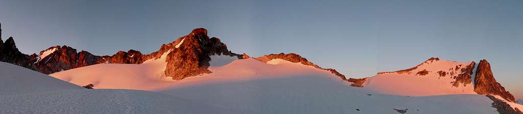
Alpenglow on Mount Logan from the Fremont Glacier
 Hogsback Glowing Hogsback Glowing |  Alpenglow on Logan Alpenglow on Logan | 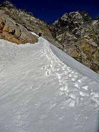 Final Snow Section Final Snow Section |  Looking Down Looking Down |  Above Park Creek Pass Above Park Creek Pass |
1 DIV (short for division) container and 1 table are used to make this. The DIV for the panorama, and the table for the thumbnails. First I'll explain about how to make the panorama. I used the following code:
<div class="image" style="width: 806px; overflow: visible;"><a href="/view_object.php?object_id=737345"><img style="width: 800px; height: 175px;" src="/images/large/737345.jpg" alt="Alpenglow on Mount Logan"></a><br><span class="caption">Alpenglow on Mount Logan from the Fremont Glacier</span></div>
Here's a useable version that you simply fill in the red blanks:
<div class="image" style="width: 806px; overflow: visible;"><a href="Image URL Page"><img style="width: 800px; height: Change Height;" src="Image.jpg" alt="Image Title"></a><br><span class="caption">Caption Text</span></div>
Keep in mind you will have to change the height of the image to the proper proportion. This can be figured out with an image editor. It is recommended you use a large image instead of an original so that page loading speed will increase. For more information on panorama's, check out 7 Ways to Post Panoramas to SP.

Image Editor used to shrink images down to 800px and receive the image height in the right proportion
Now to explain the thumbnail aspect. I decided on 5 vertical thumbnails because they show mountains very well in a small picture. Big vertical shots take up a lot of space making thumbnails ideal. Making it 5 does not stretch smaller screens while still maintaining a neat appearance. To make a 5 thumbnail table use the following code:
<table align="center"><td>Image 1</td><td>Image 2</td><td>Image 3</td><td>Image 4</td><td>Image 5</td></table>
Be sure to keep the images between the <td> and </td> tags. Where the red text is, place the image in by pressing the Insert Image Button and keeping the image size at small.
Here's an example of what it might look like when filled out (old editor):
<table align="center"><td>[img:256015:aligncenter:small:Sunrise Over GP]</td><td>[img:21138:aligncenter:small:Sitkum Spire Saddle]</td><td>[img:441088:aligncenter:small:Standard Route Drawing]</td><td>[img:424490:aligncenter:small:Glacier Basin Area]</td><td>[img:644287:aligncenter:small:The Summit]</td></table>
Unfortunately the new editor currently does not support an easy way of resizing medium images to small which is why I have no example for the new editor.
Lets Style up our Sections:
The following example talks about the camping section. Same ideas can be applied to other sections. When appropriate you can style up your sections to make them more obvious, add a little art, and show people what the camp looks like so that they will have an easier time finding it in person. I added thumbnails on both sides of the text as well. It looks something like this:
 Sunset over Camp
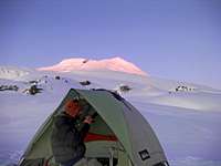 Camping near the Easton
For those who go up via the Railroad Grade, there is camping along the Railroad grade at spots. At the end of the Railroad Grade is one of the most popular camping places on the mountain where there are several flat places to pitch a tent.
Here's what the code looks like:
<div style="background: #DCFCA1; border-radius: 8px; padding: 8px; min-height: 190px; border: 1px solid #BBBBBB;">[img:201473:alignleft:small:Sunset over Camp][img:771160:alignright:small:Camping near the Easton]Camping text... </div>
On my trip reports when dealing with two vertical shots I put them inside a table to save space and to prevent blank spaces. Here's an example of this:
 Assassin Spire during Winter Assassin Spire during Winter | 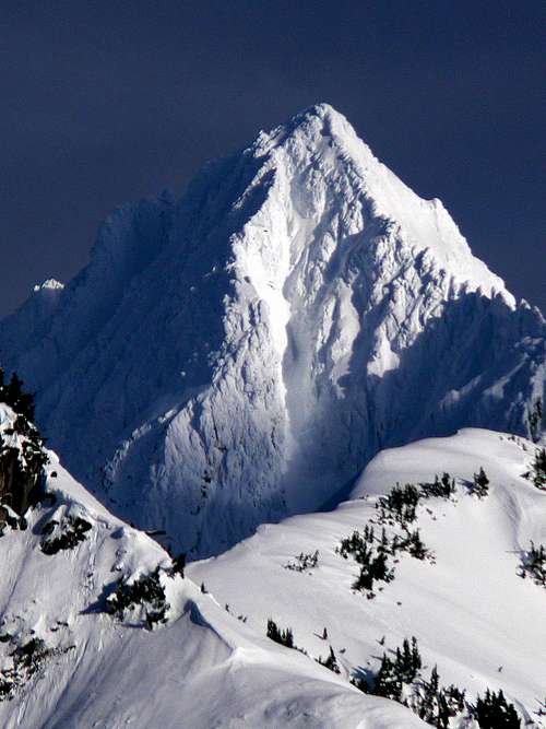 Eldorado Looking Great Eldorado Looking Great |
<table align="center"><td>[img:771116:aligncenter:medium:Assassin Spire during Winter]</td><td>[img:699492:aligncenter:medium:Eldorado Looking Great]</td></table>
Terminology
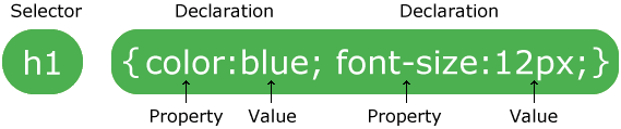
HTML - Stands for Hyper Text Markup Language. It is the most common web based language code used here on SummitPost when making any sort of customization for a page. It uses tags to display things with attributes. For example a link uses html code as seen here: <a href=http://URL_HERE>LINK TEXT HERE</a>Syntax - The way the code is properly structured for the internet browser to read. For example a table has a syntax that looks like this: <table>. It has two arrows around it with a ending tag. A more complicated example looks like this:
<table><td></td><td></td></table>
This example has proper syntax because all the code is placed in the right places according to it's html structure. Proper syntax is essential when using HTML.
CSS - Stands of Cascading Style Sheets. It allows you to style up elements (images, text, tables) and can even be used inside of html tags. Most website templates ever created on the internet are written in this code language. However, this code can be used in simple cases to save a lot of work with styling things like image captions of an entire page.
JavaScript - "JavaScript is a prototype-based scripting language that is dynamic, weakly typed and has first-class functions." -Wikipedia In this article it will only be used for the profile background image which the JavaScript will make it so the background image is random from a select few images.
Editor - An editor is a tool used to generate html and other code languages. You do not have to know a thing about html to use an editor, although when you have everything you want you will have to copy the code and place it onto SP by using a source button. SP now has a WYSIWYG (What you See is What you Get) Editor which should also help with formatting.
GPX and KML - GPX files are used for gps's (Global Positioning System) and KML files are used for displaying objects on programs like Google Earth. KMZ files also work with Google Earth as well.
Keep in mind that these words can have different definitions for non website related things. However, in this article these definitions are used exactly in the way they are provided above.
Diagrams, Topo's, and GPX Files
Sometimes it's better to show people the way rather than explain. In the mountains I'm a good navigator but I admit that sometimes reading things like "turn left, then right, then another right, back around, then left" confuses me quite a bit. Personally I'm a visual learner, I like to see what I'm doing. Diagrams, Topos, and GPX files make it a lot easier to explain things. Some will argue that this takes out the beauty of navigation, but doesn't descriptions do the same thing? The way I see it you have free choice to read or look at diagrams, if you want it an adventure, don't do any research. :-)Diagrams:
Before making a diagram one must have a good understanding of both the route and how to draw it on a picture. If details are forgotten, it is still possible to make an accurate diagram but with careful observations of topos, reading, and using programs like Google Earth.
To make a diagram use MS Paint, PhotoShop, or your personal favorite drawing program. Use a color that appropriately sticks out, most people use a medium red. After drawing the route, labels increase the usefulness of the diagram to give people an idea of what sections of the route your talking about. I use Picasa 3 to add text to some of my diagrams using the text tool.
 Adding Text to a Diagram Using Picasa 3
 Jack Mountain South Face Diagram
Topographic Maps:
When creating a page one should consider adding a topographic map. Some do this with programs, others can find it in other people's trip reports. In my case I use TrailTopo (U.S. Only). After generating the map I use PhotoShop to change the shading a little and then add the route line and save it as a .JPG file ready to upload to SummitPost. Be sure to copy the image source to maximize map details as seen in the second screen shot below.
 Zoom in all the Way for Generating a Map
 Copy the Image Source to Maximize Image Quality
Make sure the map that you upload is legal for distribution and does not violate copyright laws.
 My Profile with a Background Image
Want to display the file inside the page itself? Not a problem, but first your going to need a host for the file(s). Use something like Google Sites, Webs, Weebly, or another host for making the file public. If you have your own site, this will be an easy process. Place the following code where you want the map to display:
<iframe src="https://www.mappingsupport.com/p/gmap4.php?q=Insert URL Here" width="100%" height="500"></iframe>
After you have the file hosted elsewhere copy the source of the file which should have a .gpx extension. In my case I use kml files so here's what the code would look like:
<iframe src="https://www.mappingsupport.com/p/gmap4.php?q=https://joshlewis.us/file/sp/mlh/GlacierPeak.kml.kml" width="100%" height="550"></iframe>
Here's what it would look like posted:
To add a topolayer (U.S.only) to the map, add &t=t4 after .kml, kmz, or .gpx. It would look something like this:
<iframe src="https://www.mappingsupport.com/p/gmap4.php?q=https://joshlewis.us/file/sp/mlh/GlacierPeak.kml&t=t4" width="100%" height="550"></iframe>
To add a topolayer for Canada, add &t=t5 after the file extension.
This uses Joey's GMap4 which a full documentation on how to use this map system can be seen here.
Note that Google Maps API has a display limit of 25,000 map openings per day. So for the sake of not overloading sites like GMap4 it is recommended you limit your pages to have one embedded map per page.
For more on general mapping, check out the article Embedded maps & GPX routes.
Profile Background
I felt as though the profile was a bit too plain for my tastes so I did a complete investigation into styling it though CSS and a little bit of Javascript. My profile is an example of the following methods used for profile styling. Keep in mind that browsers like Internet Explorer will not read certain pieces of code like round corners. Firefox, Google Chrome, and Opera read this code the best as well as some other browsers.The Background:
First lets start out with a background image. To add a background you could use simple html but it's not very effective. The following script allows you to have 4 background images which it randomly selects the image every time your page views. So if you have your background as Mount Everest, there is a 1 in 4 chance that image will display. Insert the code into your profile where it says "A Few Words". Be sure to place the image url where it says "Image URL Here".
<script type="text/javascript">
<!-- Hide
pics=new Array("Image URL Here","Image URL Here","Image URL Here","Image URL Here");
lnpics=pics.length-1;
index=Math.round(Math.random()*lnpics);
document.write('<body style="background-repeat:no-repeat; background-size: 100%; background-attachment:fixed;" background='+pics[index]+'>');
// End Hiding -->
</script>
Where it says Image URL Here it is not to be confused with image I.D. or image page which will not work. An image url can be obtained on the right side of the picture page where it says [ Sizes: Orig | Large | Med | Small | Thumb ] which you'll want the original image for using as the background image. Typically they end with a .JPG, .PNG, or even a .GIF.
For reference here's the code for my profile background:
<script type="text/javascript">
<!-- Hide
pics=new Array("https://www.summitpost.org/images/original/800784.jpg",
"https://www.summitpost.org/images/original/799621.jpg",
"https://www.summitpost.org/images/original/752837.jpg",
"https://www.summitpost.org/images/original/744794.jpg",
"https://www.summitpost.org/images/original/817735.jpg",
"https://www.summitpost.org/images/original/820746.jpg",
"https://www.summitpost.org/images/original/729406.jpg");
lnpics=pics.length-1;
index=Math.round(Math.random()*lnpics);
document.write('<body style="background-repeat:no-repeat; background-size: 100%; background-attachment:fixed;" background='+pics[index]+'>');
// End Hiding -->
</script>
Want more images? After the last image there is a quote right after the .JPG url, just after the quote place a comma and put in a set of quotes "" which is where you will place the next image url.
Want less images? Remove the image with it's "quote" and it's comma which will make it now 1 in 3 chances of a particular image displaying. Be sure it is before the ); so that the code renders correctly.
 Quotes and Friends with CSS Styling
Advanced Profile Styling
The complete set of css code that makes up my profile looks like this:<style type="text/css">
/* Profile Style Code by Josh Lewis */
.content {
background:#FFFFFF;
padding:5px;
border-radius:8px;
box-shadow:0 0 5px 1px #000000 inset, 0 0 1px 1px #333333;
}
.ajax_messages_table {
box-shadow:3px 3px 5px #000000;
border-radius:8px;
}
.user_header_text {
padding:2px 0 4px!important;
box-shadow:3px 3px 5px #000000;
}
body:not(:-moz-handler-blocked) div.user_header_text {
text-shadow:0 1px 1px #333333;
}
.parent_search_list {
background-image:url(http://www.joshlewis.us/host/icon/mountain.jpg);
background-position:0 0!important;
padding-left:20px!important;
}
/* Styles the Top 27 Images */
.edit_body_div {
background-color:transparent!important;
}
#my_images {
border:4px solid rgba(0,0,0,0.4);
background:rgba(25,25,25,0.7);
box-shadow:0 0 3px 2px #222222;
}
#my_images img {
border:1px solid #777777;
transition: all 0.3s linear 0s;
}
#my_images img:hover {
box-shadow:0 0 4px 2px #4EA0DC;
}
/* Buddy List */
.friend td {
border-radius:2px;
box-shadow:0 0 5px #000000;
transition:all 0.5s linear 0s;
}
.friend td:hover {
background: #373737;
box-shadow:0 0 4px 2px #ffffff;
}
table.friend {
background:#444444;
padding:5px;
border-radius:0 0 8px 8px;
}
.friend a {
color:#8BC9FF;
text-decoration:none;
}
.friend img {
border-radius:3px;
margin-bottom:2px;
margin-top:3px;
box-shadow:0 0 3px 2px #222222;
}
div.buddy, div.web-header {
background:#418ED6 url(https://joshlewis.us/file/sp/profile/friends.png);
background-position:center bottom;
background-repeat:repeat-x;
border-width:1px;
border-style:solid;
border-color:#444444 #444444 #222222;
border-radius:5px 5px 0 0;
color:#ffffff;
text-align:center;
font-size:16px;
padding:6px 0;
font-weight:bold;
margin-bottom:-8px;
margin-top:5px;
}
body:not(:-moz-handler-blocked) div.buddy {
text-shadow:1px 1px 1px #333333;
}
body:not(:-moz-handler-blocked) div.web-header {
text-shadow:1px 1px 1px #333333;
}
/* Profile Quotes */
div.fun {
background:#444444;
border:1px solid #666666;
padding:9px;
color:#ffffff;
text-align:center;
line-height:20px;
transition: all 0.5s linear 0s;
border-radius:3px;
}
.fun img {
border:1px solid #999999;
border-radius:3px;
margin-bottom:5px;
box-shadow:0 0 3px 2px #222222;
}
div.fun:hover {
color:#EDDA74!important;
text-shadow:0 1px 1px #000000;
}
div.quote-header {
background:#E99331 url(https://joshlewis.us/file/sp/profile/quotes.png);
background-position:center bottom;
background-repeat:repeat-x;
border-width:1px;
border-style:solid;
border-color:#444444 #444444 #222222;
border-radius:5px 5px 0 0;
color:#ffffff;
text-align:center;
font-size:16px;
padding:6px 0;
font-weight:bold;
margin-bottom:-8px;
margin-top:5px;
}
body:not(:-moz-handler-blocked) div.quote-header {
text-shadow:1px 1px 1px #333333;
}
/* Profile Notice */
div.notice {
background:#FFD8A5 url(https://joshlewis.us/file/sp/profile/notice.png);
background-position:center bottom;
background-repeat:repeat-x;
border:1px solid #CCCCCC;
border-radius:8px;
box-shadow:0 0 3px 2px #222222;
color:#333333;
font-size:14px;
line-height:20px;
margin-top:10px;
padding:5px;
transition:all 1s ease-in-out;
-webkit-transition:all 1s ease-in-out;
-moz-transition:all 1s ease-in-out;
-o-transition:all 1s ease-in-out;
}
div.h-notice {
background:#DE7308 url(https://joshlewis.us/file/sp/profile/h-notice.png);
background-position:center bottom;
background-repeat:repeat-x;
border-radius:8px;
}
div.notice:hover {
color:#FFFFFF;
background:rgba(255,255,255,0);
text-shadow:1px 1px 1px #333333;
}
/* System Quotes */
.system_quote {
background-color:white;
display:block;
color:#000000;
border-radius:7px;
padding:7px;
width:725px;
margin-left:auto;
margin-right:auto;
box-shadow:5px 5px 10px #000;
font-size:11px;
line-height:15px;
border:none;
}
/* Profile Image */
div.thumb_user div {
border:1px solid #222222!important;
border-radius:3px!important;
}
div.thumb_user div a img {
border:1px solid #999999!important;
border-radius:3px;
box-shadow:0 0 3px 2px #222222;
}
div.thumb_user div div.thumbcaption {
border:none!important;
}
div.magnify {
display:none;
}
.power {
display:none;
}
.bold {
font-weight:bold;
}
.user_data_box b {
display:none;
}
div.points {
color:#558844;
font-size:14px!important;
font-weight:bold;
}
table.Occupation {
margin:0!important;
padding:0!important;
}
.Occupation td p {
margin:0!important;
padding:0!important;
}
/* Profile Background Icons */
.user_data_box {
background-image:url(https://joshlewis.us/file/sp/profile/star.png), url(https://joshlewis.us/file/sp/profile/mountain.png);
background-position:15px 14px, 162px 55px;
background-repeat:no-repeat;
background-size:16px auto, 30px auto;
box-shadow:3px 3px 5px #000000;
}
h1 {
margin-left:20px;
}
/* Header */
.right_corner_link {
background:#FFFFFF;
border-radius:4px;
padding:4px!important;
margin:15px 10px 0 0;
}
.hdr_nav {
background:#3F98DF url(https://joshlewis.us/file/sp/images/menu.png);
background-position:center bottom;
background-repeat:repeat-x;
border-color:#2D5A8A #2D5A8A #1E3B59;
border-style:solid;
border-width:1px;
}
</style>
Now for the explanations for what each piece of code does (code is in bold).
<style type="text/css"> (with an ending style tag </style>) allows you to place in CSS code into the profile. Now we are ready to start placing in CSS elements.
.content {
background:#FFFFFF;
padding:5px;
border-radius:8px;
box-shadow:0 0 5px 1px #000000 inset, 0 0 1px 1px #333333;
}
.ajax_messages_table {
box-shadow:3px 3px 5px #000000;
border-radius:8px;
}
Adds a white background to the content sections and the message area to make them readable for the background image. This also includes padding, round corners, and a nice little drop shadow.
.user_header_text {
padding:2px 0 4px!important;
box-shadow:3px 3px 5px #000000;
}
body:not(:-moz-handler-blocked) div.user_header_text {
text-shadow:0 1px 1px #333333;
}
Adds a little more padding to the header, a box shadow, and a text shadow for FireFox.
.parent_search_list {
background-image:url(https://joshlewis.us/file/icon/mountain.jpg);
background-position:0 0!important;
padding-left:20px!important;
}
Adds a little mountain icon next to each page link.
/* Styles the Top 27 Images */
.edit_body_div {
background-color:transparent!important;
}
#my_images {
border:4px solid rgba(0,0,0,0.4);
background:rgba(25,25,25,0.7);
box-shadow:0 0 3px 2px #222222;
}
#my_images img {
border:1px solid #777777;
transition: all 0.3s linear 0s;
}
#my_images img:hover {
box-shadow:0 0 4px 2px #4EA0DC;
}
Styles the top 27 images to have styling for the box as well as on hover.
/* System Quotes */
.system_quote {
background-color:white;
display:block;
color:#000000;
border-radius:7px;
padding:7px;
width:725px;
margin-left:auto;
margin-right:auto;
box-shadow:5px 5px 10px #000;
font-size:11px;
line-height:15px;
border:none;
}
Styles up the bottom quote of the profile.
/* Profile Image */
div.thumb_user div {
border:1px solid #222222!important;
border-radius:3px!important;
}
div.thumb_user div a img {
border:1px solid #999999!important;
border-radius:3px;
box-shadow:0 0 3px 2px #222222;
}
div.thumb_user div div.thumbcaption {
border:none!important;
}
div.magnify {
display:none;
}
This adds some styling to the profile image such as a light border, a box shadow, and lightly rounded corners.
Then I used an editor to add a buddy list to my profile. In the editor it allows you to make a table of 6 columns (or how ever many you want) and as many rows as needed for the number of partners and friends you have. In each table box I insert a picture that links to the users profile and then add a link to the profile below it to show the name. Once you have all the tables filled in, press the source button near the top left and get the html code. You might have to compress the code to make the display better on SP. To easily do this you can use light weight programs like Absolute HTML Compresser. When you leave big gaps in the code SP for some reason adds big gaps to the page making it look strange.
Now lets add some styling to the buddy list:
/* Buddy List */
.friend td {
border-radius:2px;
box-shadow:0 0 5px #000000;
transition:all 0.5s linear 0s;
}
.friend td:hover {
background: #373737;
box-shadow:0 0 4px 2px #ffffff;
}
table.friend {
background:#444444;
padding:5px;
border-radius:0 0 8px 8px;
}
.friend a {
color:#8BC9FF;
text-decoration:none;
}
.friend img {
border-radius:3px;
margin-bottom:2px;
margin-top:3px;
box-shadow:0 0 3px 2px #222222;
}
Be sure to add a friend class to the table or if you would rather rename the class to something else, change all the classes above. Here's a empty table with the proper class <table class="friend"></table>.
[img:816126:aligncenter:medium:Quotes and Friends with CSS Styling]
Don't want all that code inside your profile? Not a problem, there is a short hand code that links to a style sheet externally. In other words, create a file with an extension .css and host it somewhere. Inside the style sheet be sure to not have the <style type="text/css"> tag because that is a html element, not css.
Now use the following code to display this style sheet on your profile:
<link rel="stylesheet" type="text/css" href="My-Stylesheet.css"/>
If your confused by this and/or just like the way my profile is set up, use this code:
<link rel="stylesheet" type="text/css" href="https://joshlewis.us/file/css/profile.css"/>
Want to hide your online status? Here's the code to do this:
<style type="text/css">
span[style*="#F22"] {display: none;}
</style>
(might not work in Internet Explorer)
Advanced Page Styling
Oh boy, now for the most complicated part of this article. This is completely optional, but if it's implemented into a style sheet, styling pages in the future will be a breeze! CSS Styling can be done in a few ways on page. Though the style tags if using the new editor in source mode (HTML). Using an external style sheet which would have to be hosted on your own site. Or inline styling which we been using (background: #CCCCCC; padding: 3px;). HTML styling is good for individual pieces of content but is limited to what you have posted on the page and requires more coding. Here's an example of html styling:<table align="center" border="1" cellpadding="1" cellspacing="1" style="width: 100%;">
CSS styling allows you to change just about anything on the page and can be applied to more than one object at a time. For example this piece of code can change all the image backgrounds to green div.image, div.image-left, div.image-right {background: #608823 !important;}. To display the style sheet onto a page use the following code:
<link rel="stylesheet" type="text/css" href="My-Stylesheet.css"/>
If your fine with the style sheet I have, use the following code:
<link rel="stylesheet" type="text/css" href="https://joshlewis.us/file/css/sp.css" />
To create a style sheet open up a program like Notepad, place in the CSS code that you want, and save it with a .css extension at the end of the title rather than a .txt. Now it's ready for upload.
Here is the complete CSS code I use on all my pages for most of my customizations:
/* Code by Josh Lewis */
.title {padding-top: 3px !important; border: none !important;}
.main_content {line-height: 140% !important;}
.center {margin-left: auto; margin-right: auto; text-align: center;}
/* Table of Contents */
.toc_list1 a:hover, .toc a:hover {color: #FFFF99 !important;}
/* Styling for Specific Sections */
div.directions {background: #FFFFFF; border: 1px solid #FFDC9C; border-radius: 8px; padding: 8px; transition: all 1s linear 0s;}
div.routes {background: #FFFFFF; border: 1px solid #CEE2FF; border-radius: 8px; padding: 8px; transition: all 1s ease-in-out; -webkit-transition: all 1s ease-in-out; -moz-transition: all 1s ease-in-out; -o-transition: all 1s ease-in-out;}
div.red {background: #FFFFFF; border: 1px solid #FEC6C6; border-radius: 8px; padding: 8px; transition: all 1s ease-in-out; -webkit-transition: all 1s ease-in-out; -moz-transition: all 1s ease-in-out; -o-transition: all 1s ease-in-out;}
div.camp {background: #FFFFFF; border: 1px solid #CECECE; border-radius: 8px; padding: 8px; transition: all 1s ease-in-out; -webkit-transition: all 1s ease-in-out; -moz-transition: all 1s ease-in-out; -o-transition: all 1s ease-in-out;}
div.green {background: #EFFFD5 url("https://joshlewis.us/file/sp/images/camp.png"); background-position: center bottom; background-repeat: repeat-x; border: 1px solid #CECECE; border-radius: 8px; padding: 8px;}
div.blue {background: #DDE8F3; border: 1px solid #BBBBBB; border-radius: 8px; box-shadow: 3px 3px 7px #929497, inset 1px 1px 2px #BEBEBE; padding: 5px;}
div.when {background: #FFFFFF; border: 1px solid #D4C1FF; border-radius: 8px; padding: 8px; transition: all 1s ease-in-out; -webkit-transition: all 1s ease-in-out; -moz-transition: all 1s ease-in-out; -o-transition: all 1s ease-in-out;}
div.conditions {background: #FFFFFF; border: 1px solid #CCCCCC; border-radius: 8px; padding: 8px; transition: all 1s ease-in-out; -webkit-transition: all 1s ease-in-out; -moz-transition: all 1s ease-in-out; -o-transition: all 1s ease-in-out;}
div.views {background: #BDBDBD url("https://joshlewis.us/file/sp/images/views.png"); background-position: center bottom; background-repeat: repeat-x; border: 1px solid #4E4E4E; border-radius: 8px; padding: 8px;}
div.links {background: #FFFFFF; border: 1px solid #CECECE; border-radius: 8px; padding: 8px; transition: all 1s ease-in-out; -webkit-transition: all 1s ease-in-out; -moz-transition: all 1s ease-in-out; -o-transition: all 1s ease-in-out;}
div.hazard {background: #FFFFFF; border: 1px solid #999999; border-radius: 8px; padding: 8px; transition: all 1s ease-in-out; -webkit-transition: all 1s ease-in-out; -moz-transition: all 1s ease-in-out; -o-transition: all 1s ease-in-out;}
/* Styling for Specific Sections on Hover */
div.h-directions {background: #FEF3DD url("https://joshlewis.us/file/sp/images/directions.png"); background-position: center bottom; background-repeat: repeat-x; border-radius: 8px;}
div.h-routes {background: #F3F8FF url("https://joshlewis.us/file/sp/images/routes.png"); background-position: center bottom; background-repeat: repeat-x; border-radius: 8px;}
div.h-red {background: #FDE3E3 url("https://joshlewis.us/file/sp/images/red.png"); background-position: center bottom; background-repeat: repeat-x; border-radius: 8px;}
div.h-camp {background: #EFFFD5 url("https://joshlewis.us/file/sp/images/camp.png"); background-position: center bottom; background-repeat: repeat-x; border-radius: 8px;}
div.h-when {background: #EEE7FF url("https://joshlewis.us/file/sp/images/when.png"); background-position: center bottom; background-repeat: repeat-x; border-radius: 8px;}
div.h-conditions {background: #FFF6E2 url("https://joshlewis.us/file/sp/images/conditions.png"); background-position: center bottom; background-repeat: repeat-x; border-radius: 8px;}
div.h-links {background: #FDF4E0 url("https://joshlewis.us/file/sp/images/yellow.png"); background-position: center bottom; background-repeat: repeat-x; border-radius: 8px;}
div.h-hazard {background: #E6F2FF url("https://joshlewis.us/file/sp/images/hazard.png"); background-position: center bottom; background-repeat: repeat-x; border-radius: 8px;}
/* Extra Required Hover Code */
div.directions:hover, div.routes:hover, div.red:hover, div.camp:hover, div.when:hover, div.conditions:hover, div.links:hover, div.hazard:hover {background: rgba(255,255,255,0);}
/* List Icons */
.iceaxe {list-style-image: url('https://joshlewis.us/file/icon/gear/axe.jpg');}
.crampons {list-style-image: url('https://joshlewis.us/file/icon/gear/crampon.jpg');}
.helmet {list-style-image: url('https://joshlewis.us/file/icon/gear/helmet.jpg');}
.rope {list-style-image: url('https://joshlewis.us/file/icon/gear/rope.jpg');}
.glacier {list-style-image: url('https://joshlewis.us/file/icon/gear/carabiner.jpg');}
.pickets {list-style-image: url('https://joshlewis.us/file/icon/gear/pickets.jpg');}
.jacket {list-style-image: url('https://joshlewis.us/file/icon/gear/jacket.jpg');}
.water {list-style-image: url('https://joshlewis.us/file/icon/gear/water.jpg');}
.firstaid {list-style-image: url('https://joshlewis.us/file/icon/gear/firstaid.jpg');}
.glasses {list-style-image: url('https://joshlewis.us/file/icon/gear/goggles.jpg');}
.boots {list-style-image: url('https://joshlewis.us/file/icon/gear/boots.jpg');}
.pants {list-style-image: url('https://joshlewis.us/file/icon/gear/pants.jpg');}
.sunscreen {list-style-image: url('https://joshlewis.us/file/icon/gear/sunscreen.jpg');}
.map {list-style-image: url('https://joshlewis.us/file/icon/gear/compass.jpg');}
.shirt {list-style-image: url('https://joshlewis.us/file/icon/gear/shirt.jpg');}
.tent {list-style-image: url('https://joshlewis.us/file/icon/gear/tent.jpg');}
.sleeping {list-style-image: url('https://joshlewis.us/file/icon/gear/sleeping.jpg');}
.food {list-style-image: url('https://joshlewis.us/file/icon/gear/food.jpg');}
.pad {list-style-image: url('https://joshlewis.us/file/icon/gear/pad.jpg');}
.stove {list-style-image: url('https://joshlewis.us/file/icon/gear/stove.jpg');}
.spray {list-style-image: url('https://joshlewis.us/file/icon/gear/spray.jpg');}
.camera {list-style-image: url('https://joshlewis.us/file/icon/gear/camera.jpg');}
.cover {list-style-image: url('https://joshlewis.us/file/icon/gear/cover.jpg');}
.brush {list-style-image: url('https://joshlewis.us/file/icon/gear/toothbrush.jpg');}
.shorts {list-style-image: url('https://joshlewis.us/file/icon/gear/shorts.jpg');}
.shoes {list-style-image: url('https://joshlewis.us/file/icon/gear/shoe.jpg');}
.tp {list-style-image: url('https://joshlewis.us/file/icon/gear/tp.jpg');}
.poles {list-style-image: url('https://joshlewis.us/file/icon/gear/poles.jpg');}
.gps {list-style-image: url('https://joshlewis.us/file/icon/gear/gps.jpg');}
.filter {list-style-image: url('https://joshlewis.us/file/icon/gear/filter.jpg');}
/* Iframes, videos, and Maps */
div.video {background: #444444; border: 1px solid #999999; display: table; text-align: center; box-shadow: 5px 5px 10px #555555; color: #ffffff; padding: 3px 5px 5px; border-radius: 5px; margin-left: auto; margin-right: auto;}
div.video a {color: #8BC9FF; text-decoration: none; text-shadow: 0 1px 1px #2A2A2A;}
.video iframe {border: 1px solid #222222; margin-bottom: 5px; border-radius: 3px;}
iframe.topo {border-radius: 5px; box-shadow: 1px 1px 1px 1px #5D5D5D;}
/* Main Menu and Editor Menu */
.hdr_nav {background: #3F98DF url("https://joshlewis.us/file/sp/images/menu.png"); background-position: center bottom; background-repeat: repeat-x; border-color: #2D5A8A #2D5A8A #1E3B59; border-style: solid; border-width: 1px;}
#editor_menu a {color: #333333;}
#editor_menu a:hover {color: #111111 !important; text-decoration: none;}
/* Comment Area */
.discussions h2 {background: #81A341 url("https://joshlewis.us/file/sp/images/comments.png"); background-repeat: repeat-x; border: 1px solid #666666; color: #FFFFFF; line-height: 30px; text-shadow: 0 1px 1px #000000;}
/* Image Styling */
div.image, div.image-left, div.image-right {border: 1px solid #222222; padding: 5px 5px 6px !important;}
div.image img, div.image-left img, div.image-right img {margin-bottom: 2px; border-radius: 3px; box-shadow: 0 0 3px 2px #222222;}
/* New Code for Header */
.right_corner_link {background: #FFFFFF; border-radius: 4px; padding: 4px !important; margin: 15px 10px 0 0;}
#wrapper {background: url(https://joshlewis.us/file/sp/images/header.png) no-repeat scroll 270px 25px / 1028px 58px transparent;}
Now to explain some of the code:
div.red {background: #FDD5D5; border-radius: 8px; padding: 8px;}
div.green, div.camp {background: #C4FDC5; border-radius: 8px; padding: 8px;}
div.blue {background: #DDE8F3; border: 1px solid #BBBBBB; border-radius: 8px; box-shadow: 3px 3px 7px #929497, inset 1px 1px 2px #BEBEBE; padding: 5px;}
Allows you to have colored div containers by simply using the following html:
<div class=red>Text...</div>
To make your own color, create a div.color (title color what you want the class to be). Then place angled braces {} after the div and place in code like background: #000000;. Here's a diagram that gives you an idea:
  |
.iceaxe {list-style-image: url('https://joshlewis.us/file/icon/gear/axe.jpg');}
.crampons {list-style-image: url('https://joshlewis.us/file/icon/gear/crampon.jpg');}
.helmet {list-style-image: url('https://joshlewis.us/file/icon/gear/helmet.jpg');}
.rope {list-style-image: url('https://joshlewis.us/file/icon/gear/rope.jpg');}
.glacier {list-style-image: url('https://joshlewis.us/file/icon/gear/carabiner.jpg');}
.pickets {list-style-image: url('https://joshlewis.us/file/icon/gear/pickets.jpg');}
.jacket {list-style-image: url('https://joshlewis.us/file/icon/gear/jacket.jpg');}
.water {list-style-image: url('https://joshlewis.us/file/icon/gear/water.jpg');}
.firstaid {list-style-image: url('https://joshlewis.us/file/icon/gear/firstaid.jpg');}
.glasses {list-style-image: url('https://joshlewis.us/file/icon/gear/goggles.jpg');}
.boots {list-style-image: url('https://joshlewis.us/file/icon/gear/boots.jpg');}
.pants {list-style-image: url('https://joshlewis.us/file/icon/gear/pants.jpg');}
.sunscreen {list-style-image: url('https://joshlewis.us/file/icon/gear/sunscreen.jpg');}
.map {list-style-image: url('https://joshlewis.us/file/icon/gear/compass.jpg');}
.shirt {list-style-image: url('https://joshlewis.us/file/icon/gear/shirt.jpg');}
.tent {list-style-image: url('https://joshlewis.us/file/icon/gear/tent.jpg');}
.sleeping {list-style-image: url('https://joshlewis.us/file/icon/gear/sleeping.jpg');}
.food {list-style-image: url('https://joshlewis.us/file/icon/gear/food.jpg');}
.pad {list-style-image: url('https://joshlewis.us/file/icon/gear/pad.jpg');}
.stove {list-style-image: url('https://joshlewis.us/file/icon/gear/stove.jpg');}
.spray {list-style-image: url('https://joshlewis.us/file/icon/gear/spray.jpg');}
.camera {list-style-image: url('https://joshlewis.us/file/icon/gear/camera.jpg');}
.cover {list-style-image: url('https://joshlewis.us/file/icon/gear/cover.jpg');}
.brush {list-style-image: url('https://joshlewis.us/file/icon/gear/toothbrush.jpg');}
.shorts {list-style-image: url('https://joshlewis.us/file/icon/gear/shorts.jpg');}
.shoes {list-style-image: url('https://joshlewis.us/file/icon/gear/shoe.jpg');}
.tp {list-style-image: url('https://joshlewis.us/file/icon/gear/tp.jpg');}
.poles {list-style-image: url('https://joshlewis.us/file/icon/gear/poles.jpg');}
.gps {list-style-image: url('https://joshlewis.us/file/icon/gear/gps.jpg');}
.filter {list-style-image: url('https://joshlewis.us/file/icon/gear/filter.jpg');}
This styles up the gear list with icons instead of boring bullet points. But a class must be added to the bullet points for this to happen. Here is a nice little index of most of the list item's with classes added:
<b>Mandatory Gear for the Climb:</b>
<ul><li class="iceaxe">Ice Axe</li>
<li class="crampons">Crampons</li>
<li class="helmet">Helmet</li>
<li class="rope">Rope</li>
<li class="glacier">Glacier Rescue Gear (prusiks, carabiners, webbing, ect.)</li>
<li class="pickets">2 Snow Pickets (for standard glacier travel)</li>
<li class="jacket">Shell Jacket</li>
<li class="water">2-3 Liters of Water Per Person</li>
<li class="firstaid">First Aid Kit</li>
<li class="glasses">Glacier Glasses/Goggles</li>
<li class="boots">Full Scale Mountaineering Boots (or plastics if your up to it)</li>
<li class="food">Plenty of Food</li></ul>
<b>Recommended Extras:</b>
<ul><li class="pants">Nylon Shell Pants</li>
<li class="sunscreen">Sun Screen</li>
<li class="map">Map and Compass</li>
<li class="shirt">Long and Short Sleeve Shirt</li></ul>
<b>Overnight Gear:</b>
<ul><li class="tent">Tent/Bivy</li>
<li class="sleeping">Sleeping Bag</li>
<li class="pad">Ground Pad</li>
<li class="filter">Water Filter/Tablets</li>
<li class="stove">Stove, Fuel, Pot, and utensils (for cooking)</li></ul>
<b>Optional Gear:</b>
<ul><li class="camera">Camera (Highly Recommended)</li>
<li class="brush">Tooth Brush and Paste</li>
<li class="shorts">Shorts</li>
<li class="tp">Toilet Paper/Blue Bag</li>
<li class="poles">Trekking Poles</li>
<li class="gps">GPS</li></ul>
Here's what it looks like:
Mandatory Gear for the Climb:
Recommended Extras:
Overnight Gear:
Optional Gear:
- Ice Axe
- Crampons
- Helmet
- Rope
- Glacier Rescue Gear (prusiks, carabiners, webbing, ect.)
- 2 Snow Pickets (for standard glacier travel)
- Shell Jacket
- 2-3 Liters of Water Per Person
- First Aid Kit
- Glacier Glasses/Goggles
- Full Scale Mountaineering Boots (or plastics if your up to it)
- Plenty of Food
Recommended Extras:
- Nylon Shell Pants
- Sun Screen
- Map and Compass
- Long and Short Sleeve Shirt
Overnight Gear:
- Tent/Bivy
- Sleeping Bag
- Ground Pad
- Water Filter/Tablets
- Stove, Fuel, Pot, and utensils (for cooking)
Optional Gear:
- Camera (Highly Recommended)
- Tooth Brush and Paste
- Shorts
- Toilet Paper/Blue Bag
- Trekking Poles
- GPS
.discussions h2 {background: #81A341 url("https://joshlewis.us/file/sp/images/comments.png"); background-repeat: repeat-x; border: 1px solid #666666; color: #FFFFFF; line-height: 30px; text-shadow: 0 1px 1px #000000;}
Changes the color of the text comments container to green.
Inspirations
An artist usually needs an inspiration for creating something. In my case it started with pages like this one where the thumbnails were placed on either side to capture the readers attention while not taking up too much space with pictures. Then I tried to develop my own style or at least one that worked well with thumbnails and vertical images. Then I saw Steph Abegg's Picket Range page which had all sorts of styling. I realized "Hey, I know CSS. Why not try and customize SummitPost". When I found out internal styling was not allowed I was discouraged and tried the above methods on my profile. Eventually I discovered that external styling was allowed which is when I started creating styling for pages.As a web developer I try and find new methods of artistic styling. I've looked at many site templates that have a more modern look which helped with my inspirations. I then decided to try something I've never seen before with the thinking process of "what would make pictures more eye catching?". Facebook displays images though "lightbox" which has black around white text. SummitPost obviously does not use this method but instead I would create an effect though the hover property (box-shadow) as well as the opacity property. At first I manually tried to figure out the classes of SummitPost to customize things until I discovered FireBug which made it a lot easier to figure out what classes to customize. I used sites like W3 Schools to help me figure out the styling that I wanted to achieve. It took many hours of investigating but I have learned a lot that goes beyond my postings here on SummitPost. I am now able to replicate this styling on all my pages with a few pieces of code.
Special Thanks to Steve for pointing out that custom objects should be created before publishing the final copy of a page. He also helped me realize a glitch in my background image code which I figured out what went wrong. If you have any questions or suggestions feel free to send me a message.
I hope you enjoyed this article and get creative with page creation. :-D

Comments
Post a Comment