Sometimes . . Less is More
Often I see an image on SP that would benefit from cropping: Cutting off extraneous material within the image. Occasionally I won’t vote on the image because I feel that the poster hasn’t done his job (the alternative might be to vote lower than I would otherwise on an image that I otherwise like). On occasion I’ll leave a PM for the poster letting him know that I think the image could benefit from cropping.
But, why do some images benefit from cropping while others don’t require it? And how does one know when too much has been cropped from an image? To answer these questions we’ll need to discuss some very basic concepts of good photography. So, let’s start at the beginning.
Rule #1 (The Only Numbered Rule)
Rule #1 (The only numbered rule because it’s the only rule that is so important that it needs a number): Take a picture of what you’re taking a picture of! Now, this sounds pretty obvious. Yet, hand a camera to the typical snap-shooter and ask them to take a picture of you and you’ll probably have your legs cut off below the knees, your head will be lined up in the middle of the frame, and the upper half of the frame will be filled with clear, blue sky or, worse yet, solid overcast. Ugh.
![Mark and Curtis at Black Canyon of the Gunnison - Poorly Framed Image<BR><font color= #FF0000 > PLEASE DON T VOTE - SEE CAPTION</font>]()
Example of poorly framed image.
First, aren’t your feet a part of you? Why not include them? Why cut people off at the knees? Second, there’s a rule (we’ll get to it in a minute, but it has no number) that says to not place the main point of interest in the center of the image. So, if you’re taking a picture of someone, wouldn’t the main point of interest be the face? Finally, what’s with an empty blue sky? Was the request for a photo of the sky? Why? What’s interesting in the least about a bald sky? Nothing!
Now, let’s return to Rule #1. If you’re taking a portrait of someone (head and shoulders only) you might need to understand that. That would justify cutting them off just below the shoulders and filling the frame with their face. You’re taking a portrait after all.
Conversely, if you’re taking a photo of someone hiking in the mountains, you’ll want to include some evidence of those mountains. So, it's appropriate to include a little bit of mountain in the background, thus lending context to the image. Remember what you're taking a picture of: A person who's hiking in the mountains. Of course, all too often, hand the camera to someone and ask them to take a picture of you hiking in the mountains and you'll get a shot of the mountains with a person standing in the distance. “Who is that, anyway? Too far to recognize him; say isn’t that Mark’s dark blue Philmont shirt? That's what he was wearing that day, wasn't it? Must be him!” There might be some opportunity to save that image, which we’ll look at once we get to cropping. But, a couple more digressions first.
The Rule of Thirds
There’s another rule in photography called the rule of thirds (also sometimes called the rule of threes. Not rule number three, but “the rule of threes”). This rule says that when taking a photo divide the frame into three sections vertically and horizontally.
![Rafting the Ocoee - Rule of Threes<BR><font color= #FF0000 > PLEASE DON T VOTE - SEE CAPTION</font>]()
Image that follows the rule of thirds.
And then place the main subject at the intersection of either the upper left-lines, upper-right lines, lower-left lines or lower-right lines. Or, more simply, don’t place the subject along the vertical or horizontal center (as was done with the snapshot described above).
Another application of this rule, appropriate for landscape photography, is to place the horizon along either the upper or lower line, but not along the center line. In doing this the image will either emphasize the sky (horizon along the lower line) or the ground (horizon along the upper line). This is important to remember because once you get to cropping an image you may be able to relocate the horizon, should you desire. By the way: This rule is not absolute (nor is any other rule .. except Rule #1). Sometimes, especially with water reflections, it's very desirable to show balance between two halves of the image and it's aesthetically pleasing to place the horizon in the center. Don't be afraid to break any rule, just be aware of what the rule is, and why you're chosing to not follow it.
Diagonal Construction
An excellent way to compose an image is with the main subject along a diagonal across the image (upper-left to lower-right, or lower-left to upper-right). This is especially true when there are straight elements in the image (such as a river, trail, etc.).
![Lake Fork Gunnison River]()
Drawing the viewer's gaze.
Such placement gives that element a more dynamic presence. Sometimes, when cropping, you'll be presented with the chance to incorporate this rule into your image.
Look at the image above of the rafters and see how the riverflow and the path of the rafters is diagonal rather than straight across. Notice particularly that I left room for the rafters to continue in the image. That is, the viewer can see what's ahead, rather than having the rafters at the far right of the image, headed out of the picture. Bear that in mind when cropping images where there is apparent or anticipated action or movement.
Also, the diagonal element does not necessarily have to cross the image completely. Sometimes, an element that leads only partway across can effectively draw the viewer's gaze further into the picture. Such is the case with river and left bank of the canyon in the image of the Lake Fork Gunnison River, CO.
Landscape/Portrait Format and Aspect Ratio
A final rule for photography: Landscape format (with the long dimension horizontal) versus portrait format (with the long dimension vertical) doesn’t mean all landscapes are taken horizontally and all portraits are taken vertically. It’s only a generality and is often broken by competent photographers, sometimes because of the need for the other format (most commonly to adapt a landscape-formatted image for a full magazine page, or even for the cover – lucky guy!). Back in the days of film most pro’s shot each image twice; once in landscape and once in portrait. This gave them flexibility when the customer came calling for stock images. That said, today’s digital world really allows taking photos more than twice since there’s no real cost unless an image is actually printed. But, sometimes the image that is the best isn’t in the right format. Cropping may offer some opportunity here.
My next thought: I like to shoot images tight. This means I expect to do little cropping of the image when I print (which is different than I expect to do no cropping; very rarely do I take an image that I don’t crop at least a little before printing – less than 1%, I’d guess). But there are advantages to shooting loose (with lots of space around the image not expected to be used in the final print). The primary one is not knowing what size the final image will be. That is, a 4X6 (sorry, folks, but I grew up with inches), a 5X7 and an 8x10 image are not all the same aspect ratio (we’ll look at this in more detail later, so don’t fret if it doesn’t quite make sense, yet). More clearly, unless you do some stretching or squishing of the image to force it to fit, you’re going to lose some of the image when taking the same original and printing in each of those three sizes. By shooting loose, you’ll have some flexibility to adjust the final image crop without losing a valuable part of the image (a common example is printing an 8x10 when you end up having to chop off people’s feet because there’s not enough room on both sides to expand the crop frame to the left and right while keeping the feet in the image).
High Resolution is Good!
One final thought: High resolution is good. That is, you can’t recover pixels that you’ve forfeited by shooting in lower resolution modes. And, when you’re cropping, you’re going to start to forfeit all those pixels around the outside. If you shot an image that would make a fine 4x6 print, then you crop it down by half, you’ll end up with a blocky looking print with jaggies. Personally, I find that my camera performs okay when I shoot at the highest resolution mode with the middle compression setting (if I use the lowest compression setting, the camera is unbearably slow in saving image files, which is unsuitable to much of the action photography I do with Scouting). Anyway, if you have a good, high-resolution image, the chances of cropping it to something more desirable are better. Another way to think of this: Cropping in this manner is exactly what a digital zoom is doing. And because it’s exactly what the camera is doing, it’s exactly why the digital zoom should be turned off. You can do it at home, so why let the camera do the processing and limit your final flexibility with the image? Shoot it high-res, with maximum optical zoom, and then use a crop to bring the image in a little closer.
Aspect Ratio Revisited
Alright, now after all that introduction I’m just going to review a few crops and explain why I did what I did. I’ll let you decide if the resulting images were “improved” by the cropping.
Now, let’s take a look at an image of my son (left, below). I wanted a picture of him looking across the Rio Grande River to the mountains of northern Mexico. The mountains weren’t particularly attractive, but his height above the river and its meanderings were. The sky was grey (heavy overcast) and lacking in interest, as well. So, I shot an image that attempts to convey that point in time, while leaving out the extraneous details. Let’s do a little cropping considering that I want to use the image at three different locations: A photo album (4x6), a medium-size desktop frame (5x7) and a large wall frame (8x10).
![Curtis and Rio Grande (4x6 Crop)]() 4x6 Crop 4x6 Crop |
![Curtis and the Rio Grande (5x7 Crop)<BR><font color= #FF0000 > PLEASE DON T VOTE - SEE CAPTION</font>]() 5x7 Crop 5x7 Crop |
![Curtis and the Rio Grande (8x10 Crop)<BR><font color= #FF0000 > PLEASE DON T VOTE - SEE CAPTION</font>]() 8x10 Crop 8x10 Crop |
Notice the differences between the three images. As I mentioned before, this is because each of these crops has a different aspect ratio. Think of it this way: If you want to take a 4x6 and print it as an 8x10 you’ll double the width from 4 to 8 (in the example above), but you’ll have to increase the height only from 6 to 10, which is a factor of 1-2/3. If you actually printed a 4x6 double size you’d have an 8x12 print (not an unheard of size, but have you checked the cost of custom framing lately?). So, back to shooting loose and cropping: By shooting the image just loose enough to allow cropping flexibility, we’re able to select the crop that’s best suited to the image application (frame, photo album, magazine cover, etc).
Cropping the Uninteresting
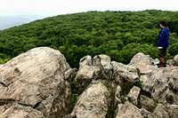
Now, let’s take a look at cropping an uninteresting part of the composition. Compare these two images.
![Shenandoah Valley View (Uncropped)<BR><font color= #FF0000 > PLEASE DON T VOTE - SEE CAPTION</font>]() Original Original |
![Shenandoah Valley View (Cropped)]() Cropped Cropped |
The uncropped image on the left has lots of bland sky; it was an overcast day and that part of the image is overexposed (it might have been more interesting had I applied a graduated density filter, but that’s a subject for
a different article). Anyway, first things first: What was I taking a picture of? Curtis looking across the rocks and hills to the Shenandoah Valley below. Both images clearly show that, so no problem there. But, the image on the left still has that bland sky, while the image on the right reduces it – perhaps even a shade more than the rule of thirds calls for. I resisted cropping it even more because then we start to lose the valley. And, in fact, I actually moved Curtis over a bit to the right (notice the crop through the rock behind him) to preserve a little bit more of the valley. So, while this isn’t a perfect rule of three composition, I’m sure that you can see how cropping reduced a large, pointless part of the image and brought into better focus what I was taking a picture of.
One final thought on this image: What would have been the impact had Curtis been smack dab in the middle of the image (still looking to the side, though)? The eye is subtly drawn by a number of things in a photograph, including lines. In addition to lines, however, the eye will also look where people in the image are looking and pointing. The right half of the image (to the right of Curtis) would have been generally ignored by the viewer of the composition (lacking anything of interest to draw the eye, as it were). That isn’t to say that people should never be placed in the middle of the image. It can be very effective to suggest that the viewer is looking over the shoulder of the person in front of him (that is, the person is facing directly away from the camera). But, in that case I’d have taken a picture of Curtis looking at the next hill, not the valley. And that’s not what I wanted to take a picture of (Rule #1)!
Cropping as a Digital Zoom
Now, let’s take a look at cropping as a pseudo digital zoom. Here are the two images:
![Mule Deer at Great Sand Dunes National Park (Original)<BR><font color= #FF0000 > PLEASE DON T VOTE - SEE CAPTION</font>]() Original Original |
![Mule Deer at Great Sand Dunes National Park]() Cropped Cropped |
The image on the left is the original, of course ("Hey, Mark, where was your rule of three's when you shot that image?!?"). At that moment the deer was interested in me, looking straight at the camera, almost always a good composition when photographing animals. I got caught with a short lens on my camera and thought the deer might wander away or simply return to his grazing (a photo of a deer with his head buried in the grass just isn’t that exciting). So, rather than go for the camera bag and the longer lens, I shot with what I had. The original image is 3072x2048 pixels, so there’s plenty of res for digital cropping and still being to print a large image. On top of that, it was the face of the deer that I was imaging (Rule #1), so I wanted the crop to concentrate on that. Switching the format to vertical seemed more natural, so that’s what I did. Finally, notice the diagonal construction of the image, after the crop, from the upper-left corner to the lower-right.
Now, a caution about using cropping in lieu of a proper lens: It can be overdone. First, a little explanation. Let’s pretend that you’re taking a picture of your daughter.
![Affect of Changed Shooting Position<BR><font color= #FF0000 > PLEASE DON T VOTE - SEE CAPTION</font>]()
Affect of Changed Shooting Position.
You’re going to fill the frame from top to bottom (portrait format) with her top sprig of hair to her cute little rock climbing shoes (okay, originally I wrote ballet, then I reconsidered my audience. Insert ballet if it suits you.) You’re going to shoot this with a wide-angle lens. That means you’ll have to be pretty close and that the wide-angle lens will gather in the top of the mountain behind her (though it will be partly hidden behind her head).
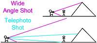
Now, suppose that you don’t have that wide-angle lens. In fact, you only have a 300-mm telephoto (that’s a long one; think of it as 6X versus what before might have been 0.5X). Well, you’re going to have to stand back a lot farther to take that photo of her from the top of her head to those climbing shoes; but you can position yourself to take the picture of her, filling the frame, just as before. But the image will NOT be the same. That’s because the background will be different. No longer is the top of the peak behind her head; more likely the base of the mountain is. The top of the peak is much higher up, off the top of the frame and way out of the picture. So, where’s all this lead? Taking a picture from far away of something and taking a picture of the same thing up close, even adjusting lenses/cropping to maintain the main subject at the “same” size, is taking two different pictures. Conversely, taking an image with two different lenses from the same place, then cropping to isolate the image area of the shorter focal length lens to that of the longer length lens, will result in a very similar picture (but with possible problems that we'll look at momentarily). In setting these situations up, the bottom line is to consider Rule #1: What are you taking a photo of?
Now, some example images (and here we purposefully go astray):
![Great Sand Dunes]() Original Original |
![Sand Dunes and Mountains (Cropped)<BR><font color= #FF0000 > PLEASE DON T VOTE - SEE CAPTION</font>]() Cropped Cropped |
The image on the left is essentially the wide angle shot (magenta lines) from the lower section of the stick figure drawing. The image on the right is a crop of a very small piece of the image on the left. You can see that the image on the right is too grainy. It is simply too much magnification of information that wasn’t there in the first place. The only way to take that image properly would be with a telephoto. But before looking at that, consider what we were taking a picture of: In the image on the right, the San Luis Valley, the Great Sand Dunes and the Sangre de Cristo Mountains behind them. On the left, a more focused image of a particular dune (Star Dune) and a particular mountain (Crestone’s twin peaks). Now, let’s take that image with a proper lens (essentially the telephoto shot in the stick figure drawing):
![Dunes Sunset with Crestone Peaks]() Telephoto Telephoto |
![Sand Dunes and Mountains (Cropped)<BR><font color= #FF0000 > PLEASE DON T VOTE - SEE CAPTION</font>]() Cropped Cropped |
First, I hope you notice that the photo on the left is clean and not grainy. Compare it to the image on the right, which is the cropped image from above. On top of the quality of the image, I waited 30-minutes for the light to cooperate, lending “texture” to the sand dunes. I also applied a graduated density filter to give the sky that darkened color. Now, something you may not realize: Both of these images were taken standing at the same place. Had I actually moved close to Star Dune to take the image on the left, it would have been different than the one on the right because I would have lost the foreground (obviously it would be behind the camera), and I would have shifted the position of the Crestone Peaks so that they would be lower above the top of the dune, losing their towering impact. This was the right place to take the image that I wanted: Showing the layers that continually form this region of Colorado.
Eliminate the Irrelevant
This should be the most obvious reason to crop of all: Eliminate material that’s irrelevant to the photo (now that you know what you were taking a picture of!). Here’s the image:
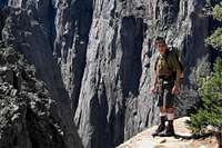
![Curtis at Black Canyon of the Gunnison (Original)<BR><font color= #FF0000 > PLEASE DON T VOTE - SEE CAPTION</font>]() Original Original |
![If You Ain t Living On the Edge ...]() Cropped Cropped |
First, Rule #1: I was taking a picture of Curtis standing above the drop-off at Black Canyon of the Gunnison to the river below – over 2000 feet. I took the image portrait format hoping to emphasize the depth of the canyon with a vertical format. But, what does the horizon in the image on the left contribute? Nothing, really. When I got home I looked at the image and realized that a crop, totally eliminating the non-contributing part of the photo was much more dramatic. In the image on the right you can almost feel the depth of the drop-off. Believe me, it’s my computer desktop wallpaper, and when it fills up the screen I really do feel the drama of that photo. Everything I eliminated from the photo was not contributing to the image and, in fact, was actually detracting from it. Especially the horizon, which gave a “safe” anchor point for the viewer. Without that horizon, the drop-off seems that much more deep and real and now. Also, consider the fallen tree in the original image: In a photo of rock and depth, what did it add? Not a thing. As for the greenery on the right, I chose to leave it because it reminds the viewer of what is being left behind.
One other point about that image on the left. Please notice that it doesn’t seem quite the correct aspect ratio. That’s because the camera I shot it with (Canon A95) doesn’t use a standard 35-mm sensor. It takes a “wide” picture. The problem is that usually you’re going to buy a 4x6 print. And that means that if you don’t crop the image yourself, you’re leaving it up to the lab to determine where that crop will be. Most likely they’ll crop it in the center, chopping a little off of both sides (or the top and bottom for landscape format). Because most snap-shooters shoot their photos loose (now
there's an understatement!), that’s the safest for them. However, it might be a better composition if the crop is shifted one way of the other, especially if you avoid chopping someone on the edge of the photo in half!
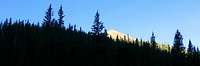
One last and final consideration about cropping and eliminating unnecessary material: Usually the aspect ratio of a photo is driven by the needs of the display situation (8x10 frame, magazine cover [I wish!], etc.). However, some images can benefit from unusual crops. The two images below show what can happen when a 4x6 image is cropped to a panorama format. In this case, a lot of unnecessary "silhouette" was eliminated, emphasizing the contrast of the trees against the blue sky, and the sunlit mountain (Baldy Mountain on Philmont Scout Ranch).
![Baldy Mountain From Copperpark - Uncropped<BR><font color= #FF0000 > PLEASE DON T VOTE - SEE CAPTION</font>]() 4x6 Original 4x6 Original |
![Baldy Mountain from Copper Park (Panorama Crop)]() Panorama Crop Panorama Crop |
Some Final Thoughts
Some final thoughts about cropping:
1. It's always a good idea to save a copy of your original image, without any edits or cropping. This will allow you the flexibility to select a different crop or edit in the future, should you need to do so.
2.
Robertthethird points out that if you plan to process the image in Adobe Photoshop® using curves, levels, or channel mixer, crop first to remove extraneous information for more accurate editing. This will also make the final file size smaller. This is likely true for users of other image editors as well.
3. When using the Unsharp mask in your editor of choice (mine is PaintShop Pro®), it's best to use it after all other edits, including cropping.
4. Finally, when you do crop you should be aware of a little "feature" that might cause the saved image to include an uncropped version of your image in the file as a thumbnail. Now, I'm certain none of you reading this will post any images out there like
Cat Schwartz from G4techTV did: They were cropped images so that she didn't reveal her nudity in the originals. Oops, except for this little
feature!
Conclusion
I hope that this provides some ideas for you to consider both while you’re shooting images, and while you’re editing them. Remember: None of the rules is unbreakable .. except Rule #1. Always take a picture of what you want to take a picture of. After that, break the rules as they suit your mood and creative style.
Up until now I've used only my images (or those where I handed the camera to someone to take a photo of me). That was because I didn't want to take someone else's image and speak poorly about it ("This is a great example of a poorly framed image ..."). However, let me take this moment to highlight a few truly outstanding SP images that deserve a second look, both because the photographers did a wonderful job capturing what they wanted, and because I believe that the reader can benefit from studying outstanding images:
Worth Another Look
Worth Another Look II
As you look at those images, consider how the photographer follows the rules I've described, and consider how he broke them.
Finally, good luck to you and good shooting!


Comments
Post a Comment